So in our last post we discussed, the steps you need to take to become a professional artist. We discussed how it’s a journey and it takes time, but it’s so rewarding to see your skills become better over time.
But, the only caveat is that you need to know what you are doing. Just relying on the adage, ‘practice makes perfect’ will not work if you do not have a solid foundation in understanding exactly what skills you need to work on and improve.
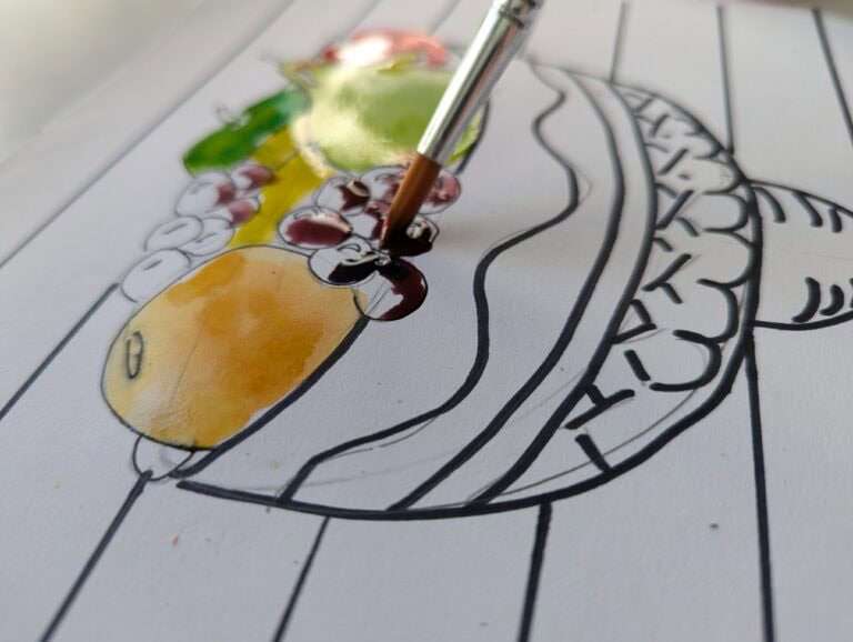
Just sitting down to paint without understanding painting skills, how to use your palette, how to layer your paintings and create depth, and how to bring color harmony into your painting and mix colors effectively will probably not get you very far. Yes, there are some individuals who are naturally able to understand color better, and how to paint with depth but even then, the guidance and critique of an artist who is ahead of them in the journey can take their artwork to the next level.
So in today’s post I am going to go through how you can understand color in the hopes that it gives you some guidance when painting. In order to accurately mix a color, you need to determine its hue, value and intensity. Today we are going to go through determining a color’s hue.
When you go to an art store and have to choose colors to paint with, you probably get a little overwhelmed. You can’t possibly buy each color (especially on an artist’s budget), so what do you do?
Here’s what you do:
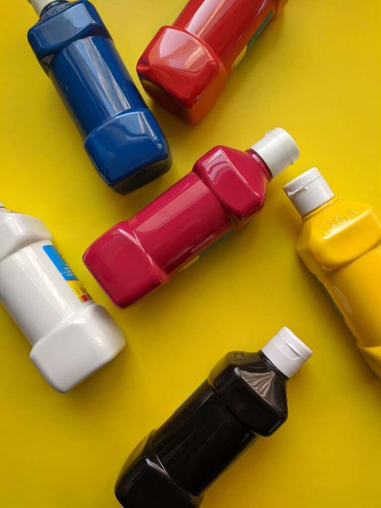
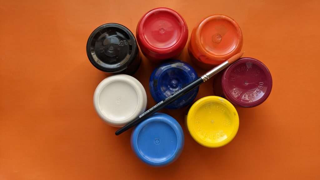
You stick to these nine pigments:
Titanium white
Ivory Black (although paynes grey is a good option to add as well, as it doesn’t make the colors so flat as black does)
Cadmium yellow pale
Cadmium orange
Cadmium red medium
Alizarin crimson
Cobalt violet
Ultramarine blue (although if you are buying student quality and not artist quality, buy cobalt blue instead)
Permanent green
It can be tempting to add a variety of appealing colors especially with fascinating sounding names like ‘rose madder’ and ‘van dyke green’ but if you are starting out on your color mixing journey, the best thing to do is to stick to these nine hues. (it’s also better for your wallet)
The reason you want to stick to these nine pigments is that it will force you to rely on mixing your hues just based on these. You will be exercising your mixing muscles and getting better at mixing hues and understanding color. Plus, often the colors straight from the tube are lacking depth and color clarity and by mixing your own pigments you have more control over its clarity and you save money!
Once you have mastered mixing the hues with this limited palette, you can add more pigments to your palettes. But make sure you have a good understanding of mixing hues with just these nine pigments before.
So what do we do with these nine pigments?
We use them to create our color wheel. We paint our primary colors, then our secondary and then use our primary colors to create the hues that are halfway between primary and secondary colors. This means we end up with yellow, yellow-orange, orange, red-orange, red, red-violet (mixed with alizarin crimson), violet, blue-violet, blue, blue-green, green, and yellow-green all around our color wheel.
This is the exercise I do with all my students as this teaches exactly how to mix any hue, with just our primary and secondary colors. I adapt it for each age, but any student from age four will learn how to use the color wheel as once they’ve done it, they understand exactly how to mix all these hues.
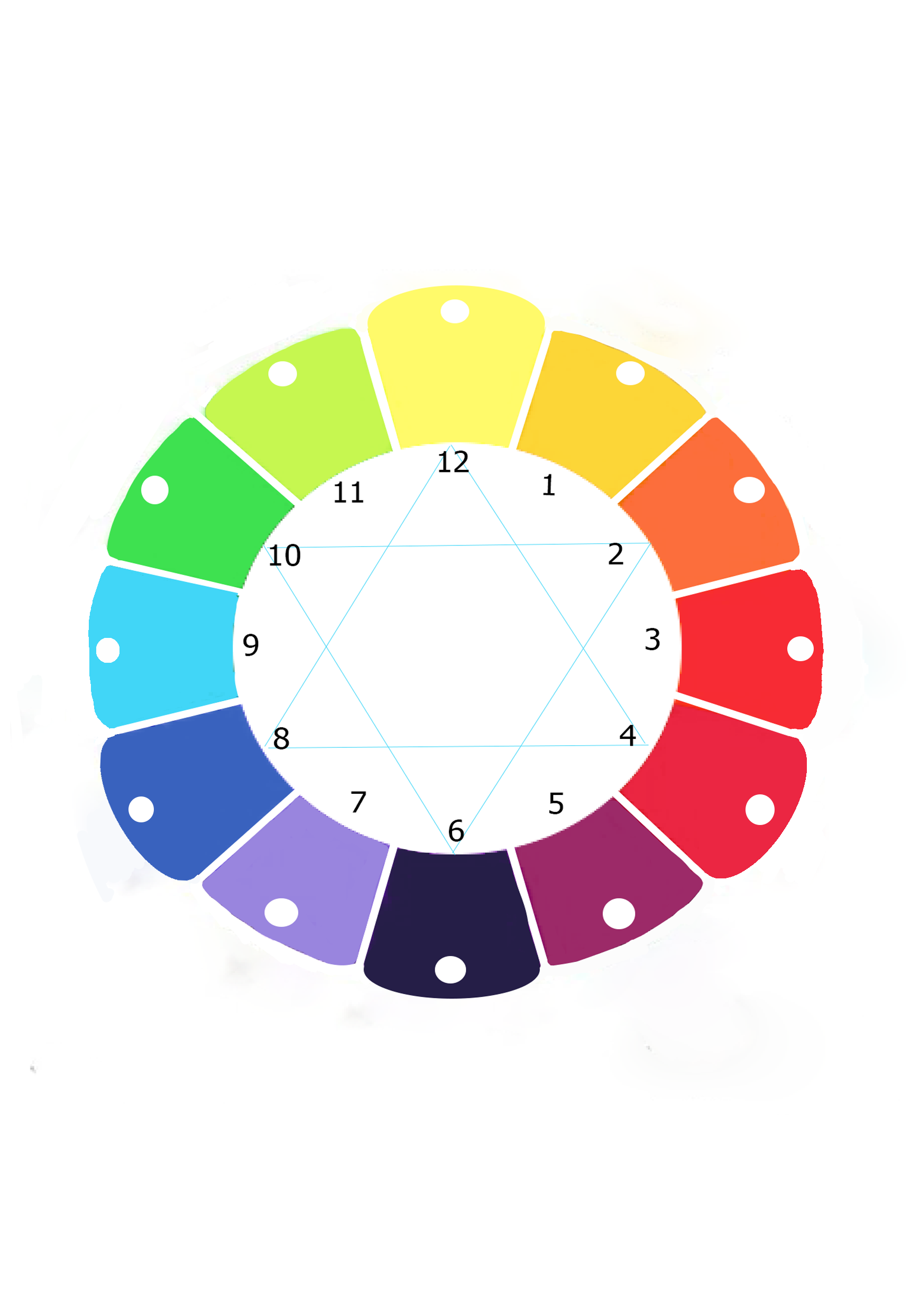
You do need two reds: Alizarin crimson to use when creating violet and cadmium red for the oranges. Other than that, you need one blue and one yellow to create any hue you’d like.
When teaching I do use cool blue and warm yellow when needed as it’s helpful for landscape paintings.
But what about brown? How do I make lighter and darker colors? How do I make bright or dull colors? That we will cover in our next post, but for now we want to practice seeing the colors around us and determining which hue it comes from.
I hope that helps you understand what pigments you should be purchasing, and what we can do with them. Play around and have some fun with them and see how many hues you can mix just with these nine pigments. You’d be surprised by how easy it is to mix colors once you know how!
And if you are interested in learning more sign up for our waitlist for our beginner’s course here or our kids and teen classes here.