Struggling with flat, lifeless paintings even though your colors look “right”? You’re probably missing the single most important element in art—and it’s not what you think. In this post, I’ll reveal why value (not color) in painting is the secret to creating paintings with depth, dimension, and that professional “wow” factor, plus give you 3 simple exercises to master it.
I can usually tell within the first few minutes if a student has learned from another teacher. Not because their technique is bad—often it’s quite good. But there’s one skill that’s almost always missing: value. And that’s the difference between a painting that looks “fine” and one that makes people stop and stare. Value is hands-down one of the hardest skills to master in art, but once you crack it? Your paintings transform overnight. I’ve watched students who’ve painted for years suddenly create work that looks professional, simply because they finally understood value in painting.
What is Value (And Why Does It Matter More Than Color)?
Value is simply how light or dark something is, regardless of its color. A bright yellow and a pale blue can have the same value. A deep purple and a dark green can be identical in value, even though they’re completely different colors.
Here’s the truth that can transform your paintings: Value creates the structure of your painting. Color just decorates it.
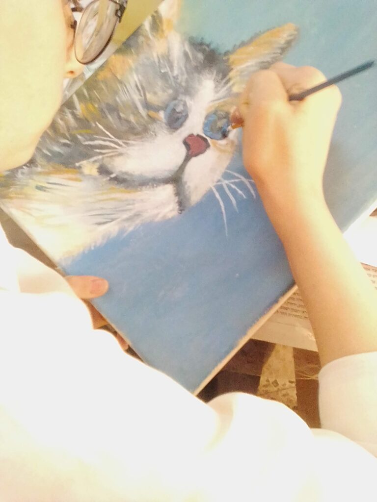
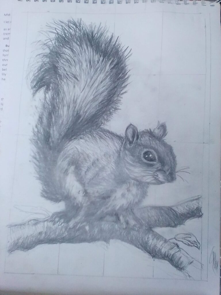
Think of value as the bones of your artwork and color as the clothing. You can dress someone in the most beautiful outfit, but if the structure underneath isn’t right, something will feel off. That’s why most of my art projects that I do with my students are about understanding value as that’s the most important skill they will need to use in their artwork. The image below is of a student’s artwork focused on value.

Why Beginners Struggle With Value
When we look at the world, we see color first. It’s natural. We say, “The sky is blue,” “The grass is green,” “The barn is red.” But what we often miss is how light or dark those colors are in relation to each other.
This is why so many beginners:
- Create paintings that look flat, even with “correct” colors
- Struggle to create depth and dimension
- Can’t figure out why their paintings lack impact
- Get overwhelmed trying to mix the “perfect” color
The secret? They’re focusing on color when they should be focusing on value.
The Black and White Test (Try This Right Now)
Here’s a simple exercise that I teach students through different projects:
- Take a photo of something you want to paint—a still life, a landscape, a reference photo
- Convert it to black and white (every smartphone can do this)
- Look at the range of values from pure white to pure black
Can you see the darks, mid-tones, and lights clearly? Can you identify at least 5 different values?
Now look at one of your paintings and do the same thing. Does it have the same range of values, or is everything hovering in the middle?
This simple test reveals everything.
How Value Creates Magic in Your Paintings
When you get your values right, several things happen almost magically:
1. Your paintings gain depth and dimension Objects that are lighter or darker than their surroundings pop forward or recede. This is how you create the illusion of three-dimensional space on a flat canvas.
2. Your focal point becomes obvious The strongest contrast in value (light against dark) naturally draws the eye. You can literally guide the viewer exactly where you want them to look.
3. Your colors look more vibrant Ironically, when you focus on value first, your colors automatically look better. A bright color surrounded by the right values looks luminous. The same color with wrong values looks muddy.
4. Your paintings have impact from across the room Ever notice how great paintings grab your attention even from far away? It’s not the color—it’s the bold value structure. Squint at a masterpiece and you’ll see strong, clear shapes of light and dark.
How to Train Your Eye to See Value
This is a skill, and like any skill, it improves with practice. Here are three exercises I use in my classes:
Exercise 1: The Squint Test
Squint your eyes when looking at your subject or reference. This blurs the details and colors, making values easier to see. If you can’t tell what’s light and what’s dark when squinting, your values aren’t strong enough. You can also squint at your reference image to check that the dark and light values are the same value as your artwork.
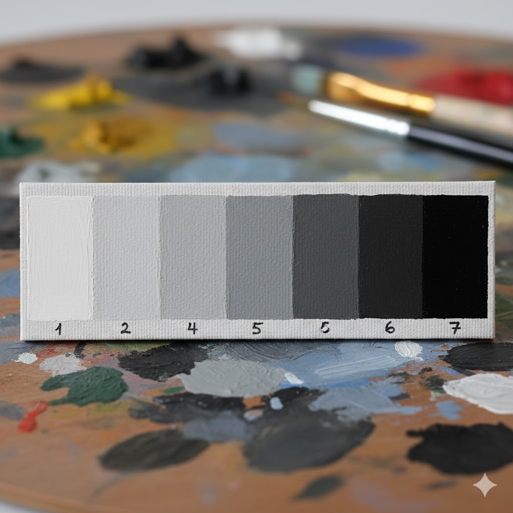
Exercise 2: Value Scale Practice
Create a simple value scale from white to black with 5-7 steps. Then practice matching everything you see to one of those values. Is that tree a value 3 or a value 5? This trains your eye to judge relationships. And don’t worry- this skill is tricky, but it definitely can be mastered!
Exercise 3: Start in Grayscale
For your next painting, do the entire underpainting in just black and white (or a monochromatic color). Get all your values right first. Then add color on top. You’ll be amazed at how much easier it becomes.
Free 5-Day Art Challenge
Master the fundamentals of art in 5 days. Stop copying, start creating.
The Simple Rule That Changes Everything
Here’s what I teach my students:
“If your values are right, your colors can be wrong and the painting will still work. But if your values are wrong, even perfect colors won’t save it.”
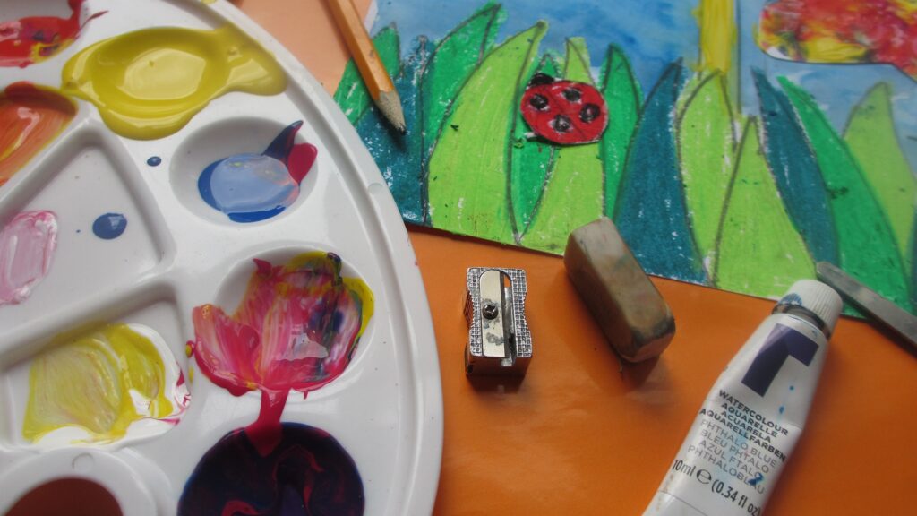
I give my students several different projects to complete that teach value, so it’s easier to grasp once we start painting. I also teach children as young as six to see the values in objects as the younger they learn, the more they are able to use this skill as they get older. As you can see in the project below, I demonstrate to the students how they can use different values of green, instead of just using one green in their grass.
Your Action Step This Week
I want you to try this to practice creating value in painting:
Choose a simple subject—maybe an apple, a coffee cup, or a landscape photo. Before you paint it in color, do a quick value study. Use just black and white paint (or a single color like burnt umber mixed with white). Remember you can squint your eyes to see the darkest value and lightest value and paint in that shape. You can also look where your light source is coming from as this helps determine where your lightest and darkest value area will be.
Spend 15-20 minutes getting the values right. Don’t worry about details, just focus on the light, medium, and dark shapes.
Then, if you want, paint the same subject in color, using your value study as a guide.
I promise you’ll see the difference immediately.
Looking for more art tips to make you a better artist? Check out this blog post.
The Bottom Line
You don’t need more expensive paints. You don’t need to master complex color theory. You don’t need years of experience.
You need to understand value in painting.
It’s the one thing that will transform your paintings from flat and lifeless to dimensional and captivating. And the best part? Once you train your eye to see it, you can’t unsee it. Every painting you create from that point forward will be stronger.
So the next time you’re frustrated with a painting, stop thinking about color for a moment. Squint at it. Take a photo and convert it to black and white. Ask yourself: “Are my values working?”
That’s where the magic lives.
Ready to dive deeper into the fundamentals that actually make a difference in your art? Join our waitlist for our Beginner’s Course where we break down essential skills like value, composition, and color in a way that actually makes sense.
Have a question about value or want to share your value study? Reply to this post—I’d love to see what you’re working on!